SURREALISM
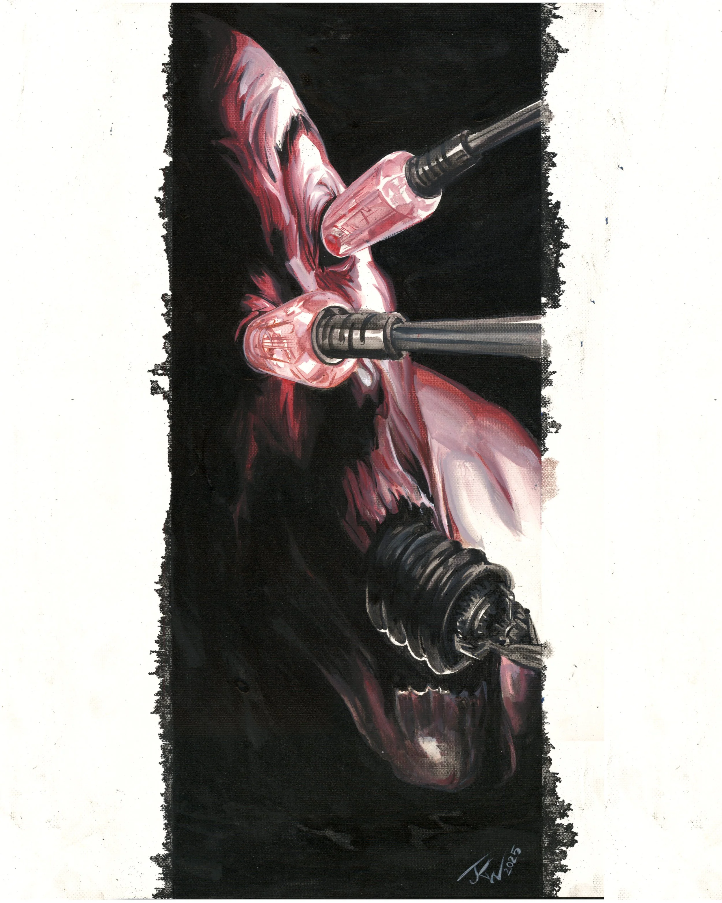
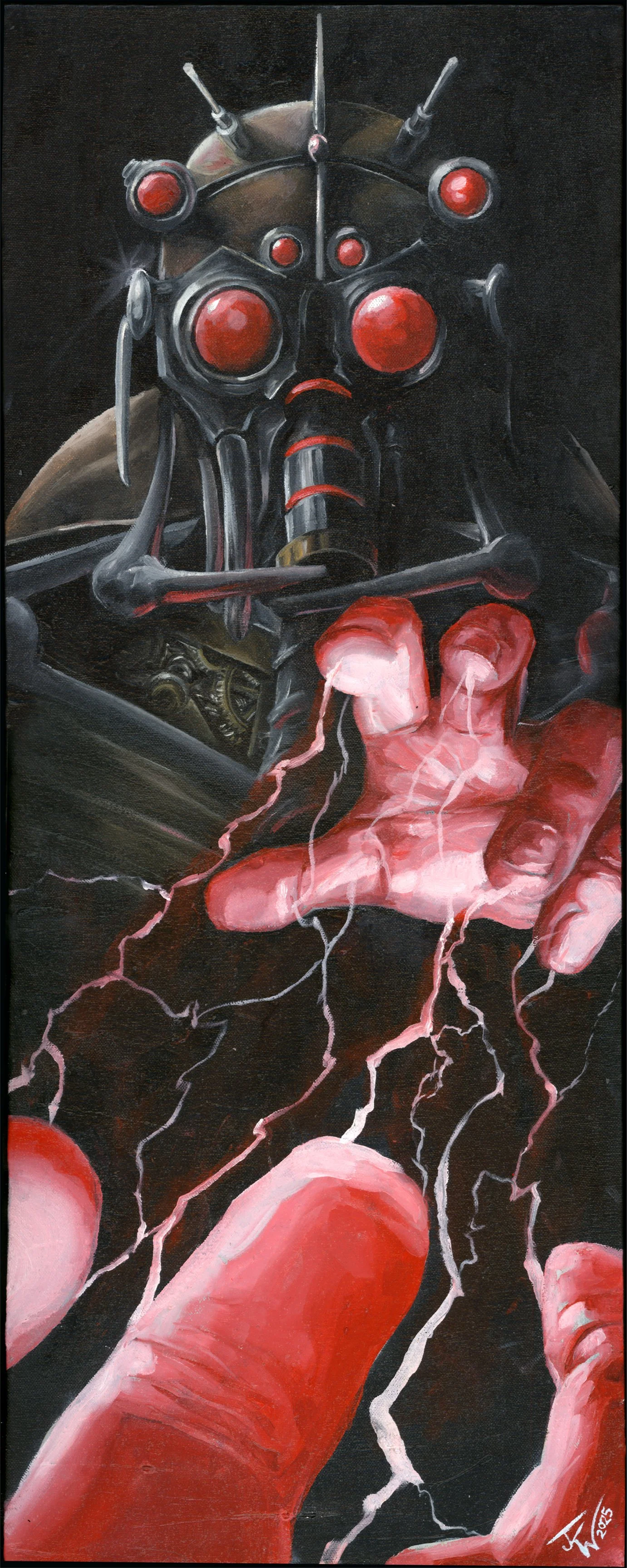
The Blackstar Series was inspired exclusively by David Bowie’s last album and its corresponding videos. Released on January 8, 2016, Bowie's 69th birthday, the album was recorded in secret in New York City with his longtime co-producer Tony Visconti and a group of local jazz musicians: Donny McCaslin, Jason Lindner, Tim Lefebvre and Mark Guiliana. David Bowie would die 2 days after the release of the album, but he left behind his swan song with an inspiring power that drove me back to the easel for this series.
Black Star I
oil on 15” x 30” canvas
2024
Before painting a texture was added by applying a thick coat of gesso with a steel wool pad. That texture was then stained with a mixture of burnt sienna, yellow ochre and a liberal amount of linseed oil.
Black Star II
oil on 12” x 30” canvas
2024
Before painting a texture was added by applying a thick coat of gesso with a steel wool pad. That texture was then covered in black providing shadow. Titanium white was applied to create the positive space, leaving the black background for shadow, before the crimson and yellow ochre were applied for colour.
Black Star III
oil on 12” x 30” canvas
2024
This one is currently in production
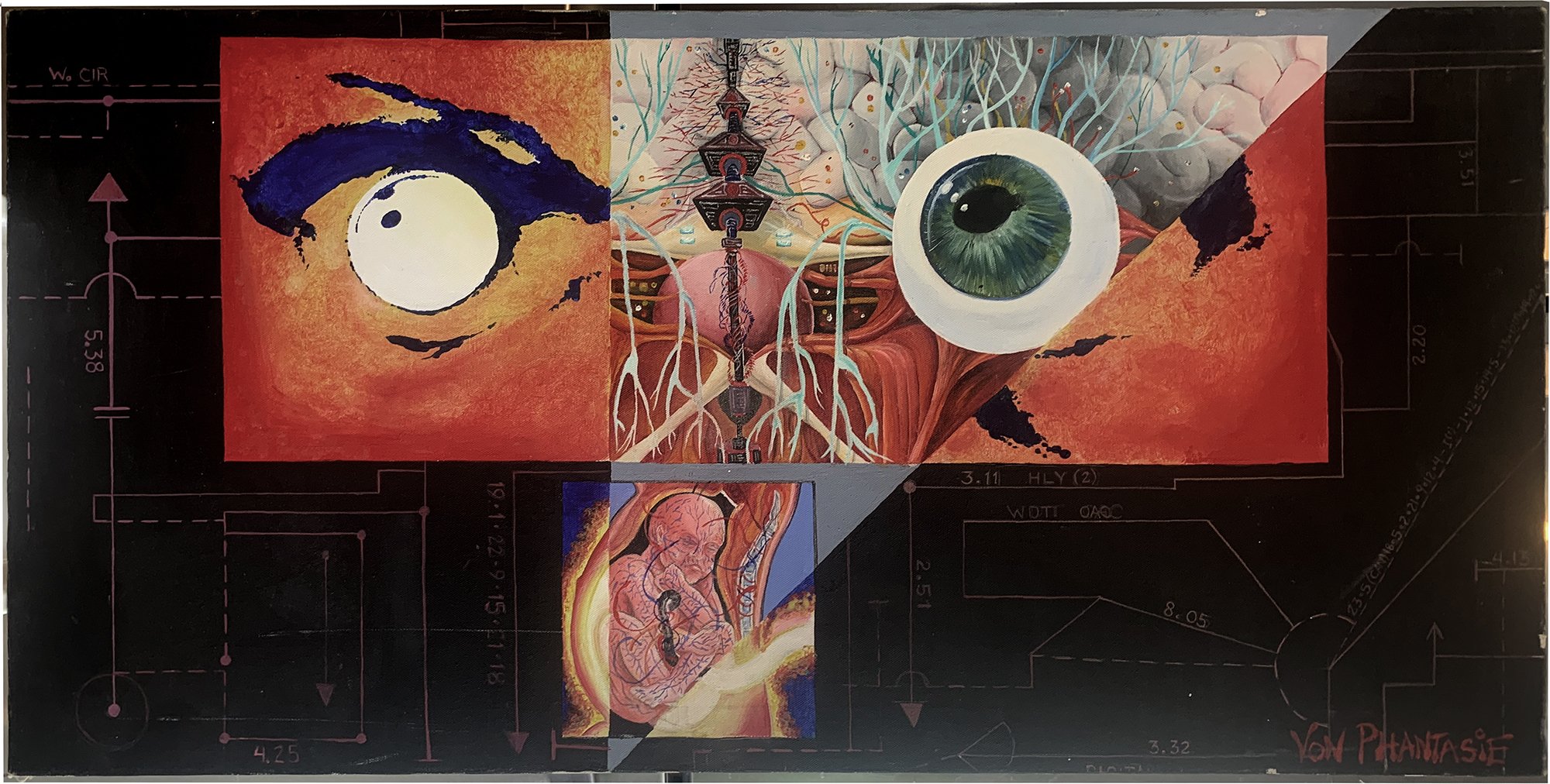
The Digital God Series was a 3 act story representing birth, the development of sentience , and the ascension to omniscience. It starts with an AI that creates biological life that develops along with its own consciousness to crete a superbeing who transcends time by existing in the same moment eternally, eventually realising it cannot exist, but is unable to die.
Digital God I
oil on 36” x 48” canvas
1991
Painting on a budget! This painting uses only 3 colours: Napthol Red, Lamp Black, and Titanium White. It turns out this budgetary restriction worked out well.
Digital God II
oil ,spray paint & acrylic on
36” x 36” canvas
1991
The background was primed with black acrylic and white gesso splatter. The brain, painted in oil and later augmented with acrylic, before stenciling and spray-painting.
Digital God III
oil on 24” x 48” canvas
1991
I recreated the same palette restrictions as I had with “Digital God I” only breaking my rule once with the eye.
Digital God IV
oil acrylic, and spray paint on
48” x 60” canvas
1992
Ultramarine blue and white spray paint covered later with black gesso rectangles with a combination of oil and acrylic for the images within. This painting was representative of the journey to omniprecience.
Digital God V
oil and acrylic on 24” x 48” canvas
1992
This was actually the first painting in the series, but since it represents the actual identity of the series, it felt more like the end of the character’s first act.
Digital God VI
oil, acrylic, ink, gouache on
48” x 60” canvas
1992
This was until recently an unfinished oil painting. It is now an unfinished mixed media painting. 2 rectangled pieces were added to the piece in 2023 and 2024 using ink, gouache and acrylic.
Digital God VII
oil on 36” x 48” canvas
1998
This was originally a comic character I created for a comic appearing in Fetish Magazine(AVN Media 1998), but I really wanted to realise it as an oil painting and so I made it part of this series.
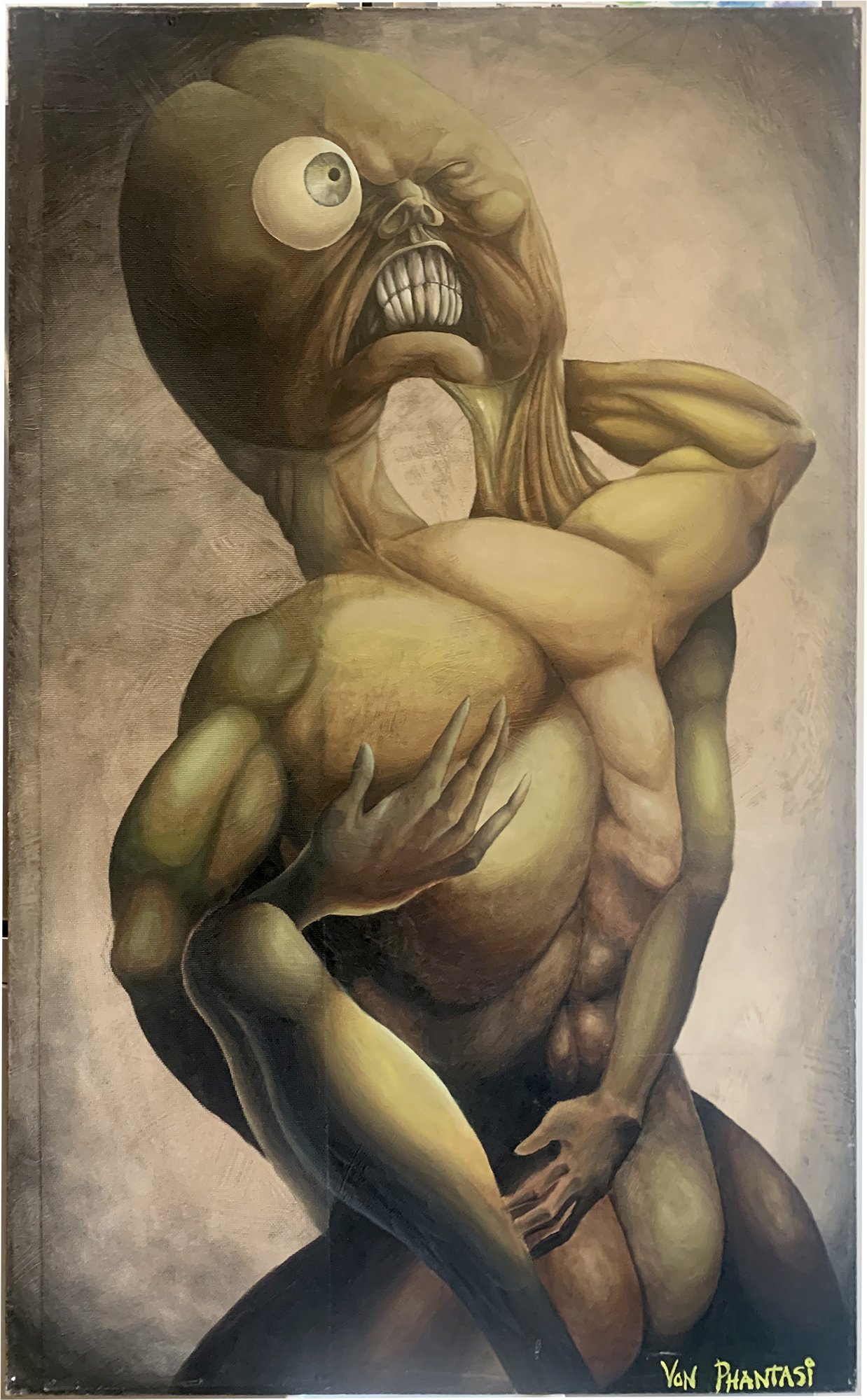
The Flesh Angel Series was created as a comic combining 3 very different stories with the same narrative. 2 stories were very real, but the third was a monochromatic and viceral hullicination which is represented here. In the end there were 26 paintings, most lost to time, but I still have these 4 and all paintings still exist in a comic and as art in a CD booklet for a German industrial band from 2001.
Flesh Angel I
oil on 16” x 24” canvas
colours: burn umber, lamp black, yellow ochre and titanium white.
Flesh Angel II
oil and assemblage on 24” x 24” canvas
dried sticks were applied with gel polyeruthane and then the whole thing was coated with gesso before painting in oil. colours: burn umber, lamp black, yellow ochre and titanium white.
Flesh Angel III
oil on 36” x 48” canvas
Before painting a texture was added by applying a thick coat of gesso with a steel wool pad. A 8 wide strip of screen was then applied and held with the dried gesso. That texture was then stained with a mixture of burnt sienna, yellow ochre and a liberal amount of linseed oil, before painting with oil. colours: burn umber, lamp black, yellow ochre and titanium white.
Flesh Angel IV
oil on 36” x 36” canvas
Before painting a texture was added by applying a thick coat of gesso with a steel wool pad. A spider web was creted with kite string and adhered with the gesso. That texture was then stained with a mixture of burnt sienna, yellow ochre and a liberal amount of linseed oil, before painting with oil. colours: burn umber, lamp black, yellow ochre and titanium white.
Flesh Angel V
oil, india ink and gouache on 22’” x 56” canvas
Originally this was a panel from the Flesh Angel comic (issue 1) and it was composited in Adobe Photoshop using several pieces of art I had done in multiple media. I wanted to see what it would look like painted “organically” using traditional media only on a larger surface.the painting itself was designed to create a feeling of anxiety. I designed the unal to be moving towards te viewer, while the elements that appear to exist as “real”(subway car, commuters) are moving away from the viwer and seem unaware of the surreal aspects.
Flesh Angel VI
oil, india ink and gouache on 22’” x 56” canvas
After doing what was originally a composite piece, based on previously completeed work, I thought I’d try an orignal piece with the same look.
At this time, t is a work in progress, but it represents the first half of the character arc in this story.
I useec ink and water for the subway backround and then mostly oil for the surreal foreground.
Flesh Angel VI
oil, india ink and gouache on 22’” x 56” canvas
Flesh Angel VII
oil, india ink and gouache on 22’” x 56” canvas
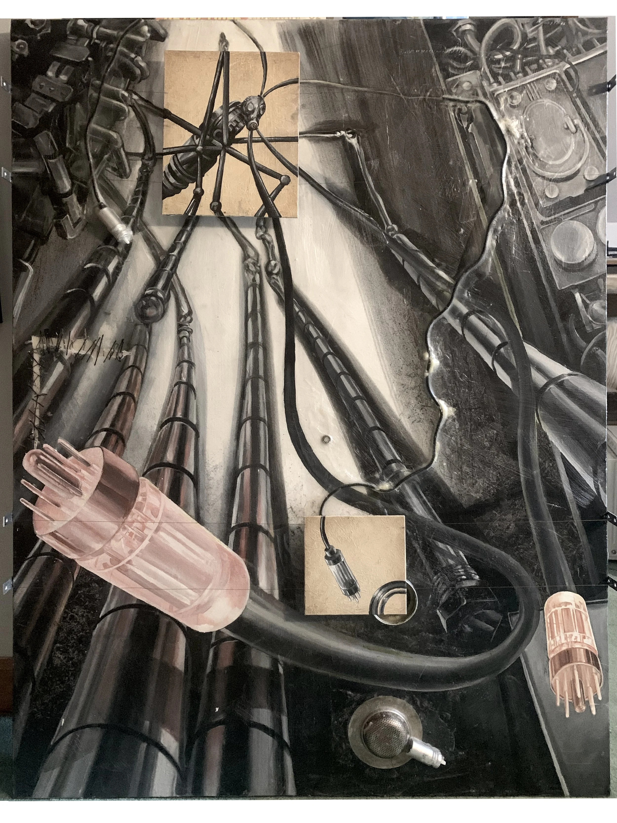
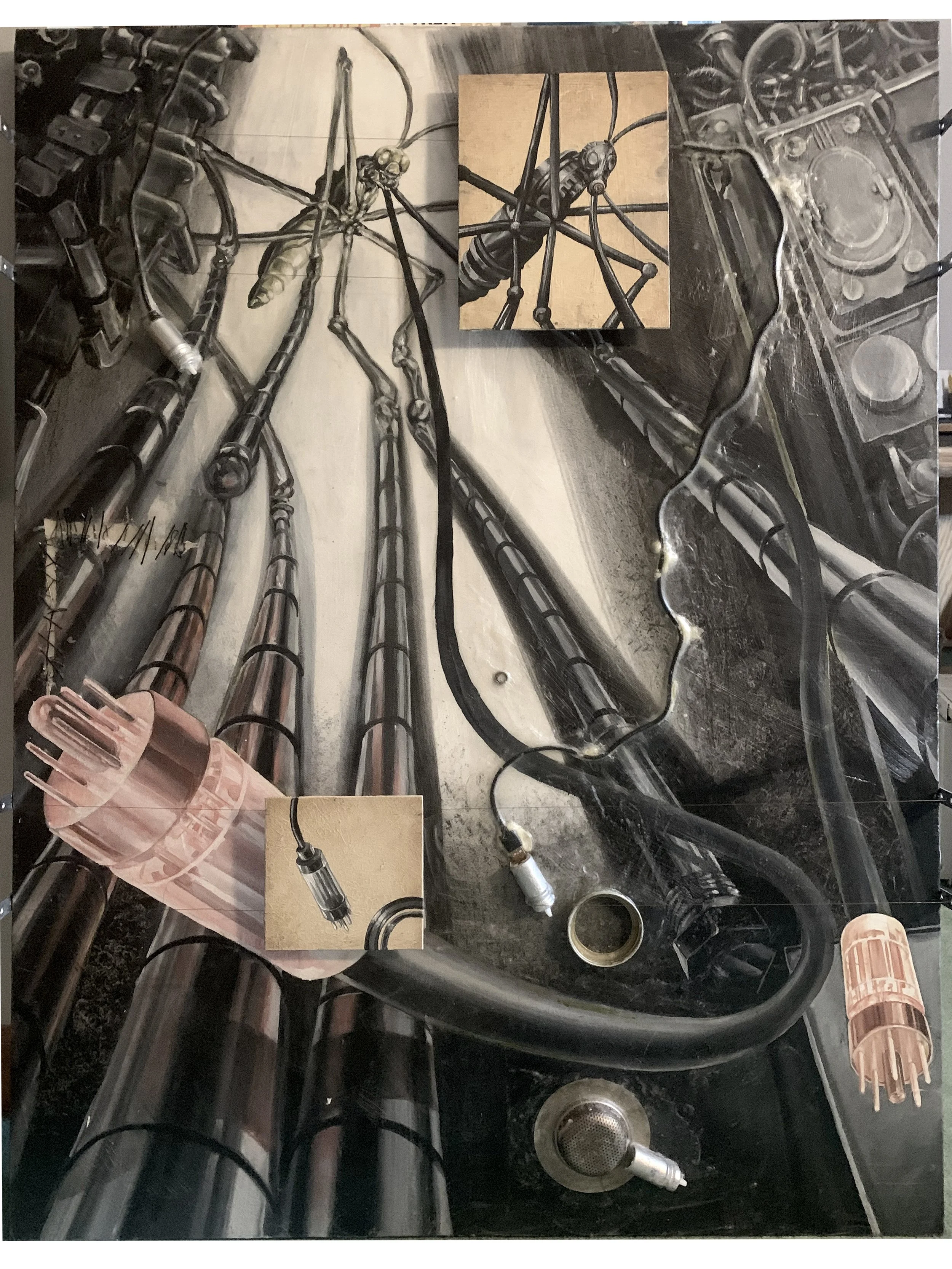
The Mah’kra City Series is a story about a machine city where in it’s inhabitants have no other purpose but to maintain it. The purpose of the city is at this time, unclear. I used a very similar palette as I did for Flesh Angels, though the intention is that this series presents more brass and less earth tones.
Mah’Kra City I
oil, india inkand acrylic on 6’” x 30” canvas
Before painting a texture was added by applying a thick coat of gesso with a steel wool pad. That texture was then stained with a mixture of burnt sienna, and a liberal amount of linseed oil. a mixture of water and ink was then splattered on the canvas and allowed to drip and the foreground creature was painted in acrylic..
Mah’Kra City II
oil and acrylic on 6’” x 28” canvas
Before painting a texture was added by applying a thick coat of gesso with a steel wool pad. That texture was then stained with a mixture of burnt sienna, jet black and a liberal amount of linseed oil, which was applied in horizontal streaks with rags The burnt paper texture of the corner was masked and dry brushed with oil paint and the wasp creatures were painted in acrylic.
Mah’Kra City Morpher
oil and mineral spirit, acrylic, ink and assemblage on 36’” x 48” canvas
The original design concept was worked out on bristol board with ink wash. The painting was treated with mineral spirit before oil was applied to give it an ink wash look, 2 sepearte paintings were created and suspended from brass wire 2 inches above the canvas and can be slid and adjusted to appear over the conterpart image.
Mah’Kra City Transformation
gouache and ink on 16” x 20” canvas
Mah’Kra City Hound
oil on 12” x 30” canvas
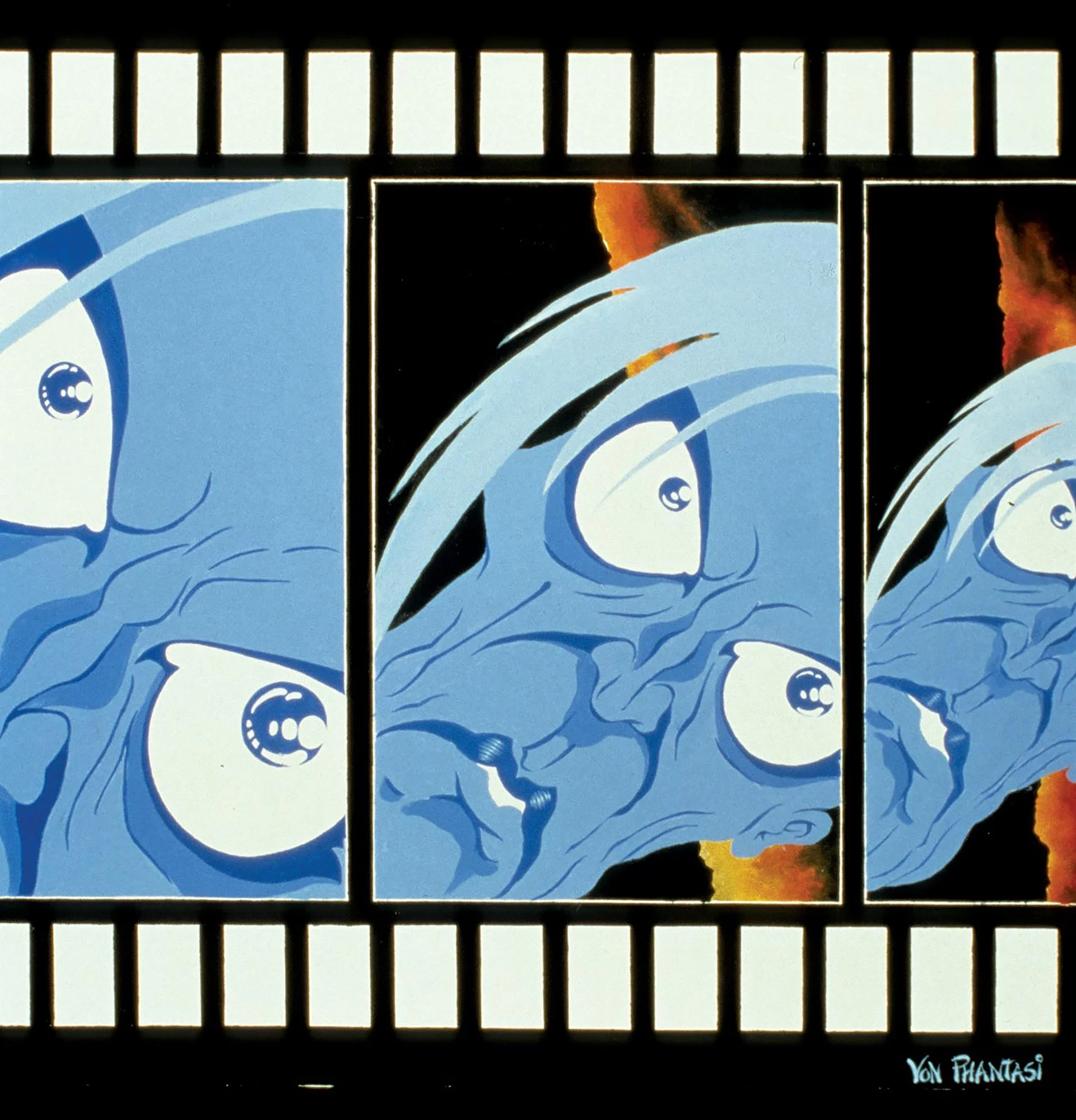
The Media Christ series was a response to an emerging internet culture in the early and mid 90’s. The series was long since forgotten, but in 2017, I was reminded of it and found my concerns at the time to have an almost charming naivete’, compared to the age of social media. I created a new piece from the series for an article written by Jarrett Melendez 23 years later for a study in social comparison.
Media Christ I
assemblage, acrylic and oil
on 36” x 48” canvas • 1994
The canvas was covered with a gel polyurethane over segments of the LA Times. A solution of acrylic red and water was applied over it and sealed in a matte varnish. The blue character was painted in acrylic. 30 years later, I painted a small segment in oil revealing just below the blue dermis.
Media Christ II
assemblage and acrylic on 12” x 24” canvas. • 1994
Same technique used for “Media Christ I” though there was no 30 year later addition in oil— …yet.
Media Christ III
assemblage and acrylic on 18” x 18” bristol • 2001
10 Deutsche mark bills were fixed to paper with aerosol adhesive. The foreground character was painted in acrylic
Media Christ IV
assemblage and acrylic on 18” x 18” bristol* 2001
10 deutsche mark bills were fixed to paper with aerosol adhesive. The foreground character was painted in acrylic
Media Christ V
acrylic on 18” x 24” canvas
2001
I painted this homage to Katharina Fritsch’s “Company at the Table” shortly after seeing the exhibit at the Museum für Moderne Kunst in Frankfurt Germany.
Media Christ VI
oil on 36” x 48” canvas
1996
I painted this after a fierce case of face pareidolia had me seeing this exact fused face mess in a carpet pattern after waking from a rough night. I immediately painted it in oil while it was fresh.
Media Christ VII
oil and acrylic on 24'“ x 60” canvas • 1997
During this period in time I was working as a multi-media producer and was doing mostly animation. It was inevitable it would make its way into my paintings.
Media Christ VIII
oil & acrylic on 48” x 48” canvas 1997
The character’s hue is cold colours, so I chose a warm palette for the background to push it forward. I used oil with a dry brush technique to take away all hard edges so the sharpness of the line work would be accentuated in the foreground.
Media Christ IX
oil, acrylic and assemblage on
60” x 72” canvas • 1997
This is the first of 4 paintings in the series that will incorporate a slogan. It was at this point in the series taht I wanted to just come out and use the words that I felt being shouted at me through the emerging internet community. The top of the maze is made up of cut up strips from the L.A. Times.
Media Christ X
assemblage and acrylic on
48” x 48” canvas • 1998
I attached circuit boards, wire and magazine cut outs using a spray adhesive and then sealing it with gel polyurethane. I applied red acrylic to the background before painting the foreground character, also in acrylic.
Media Christ IX
oil on 60” x 72” canvas
1998assemblage and acrylic on
11” x 14” canvas • 1998
I attached circuit boards, wire and magazine cut outs using a spray adhesive and then sealing it with gel polyurethane. I applied red acrylic to the background before painting the foreground character, also in acrylic.
Media Christ 2017
gouache on
18” x 24” cold-pressed cotton paper • 2017
When I revisited the series, I intentionally chose to keep the character and themes of breakage, but of course, had to include a nod to the new texh and social media.


